PT
Gianluca Zaffari é uma rede de gelaterias no sul do Brasil que desde 1995 adoça a vida dos seus clientes. Porém, a relação deles com o sorvete é bem mais antiga, já que veio da Itália com a família.
Nesse projeto, fui chamado para desenvolver um selo comemorativo dos 25 anos de tradição em gelatos e uma nova comunicação para a marca, buscando contar essa história de uma forma que resgatasse as origens e essa paixão pelo que eles fazem artesanalmente há tanto tempo.
ENG
Gianluca Zaffari is a gelateria company from south Brasil that since 1995 makes its customers lives sweeter. But, their relationship with ice cream is much older than that, since it came from Italy with the family.
In this project, I was called to develop a celebratory label for the 25 years of tradition in the ice cream business and a new communication for the brand. The mainly objective was to tell this story in a way that explored the origin and passion for what they handmade craft for so long.
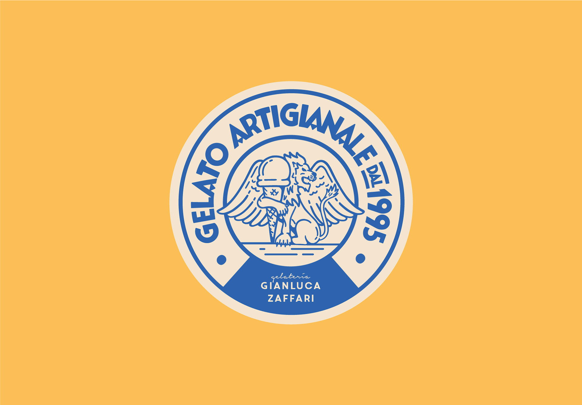
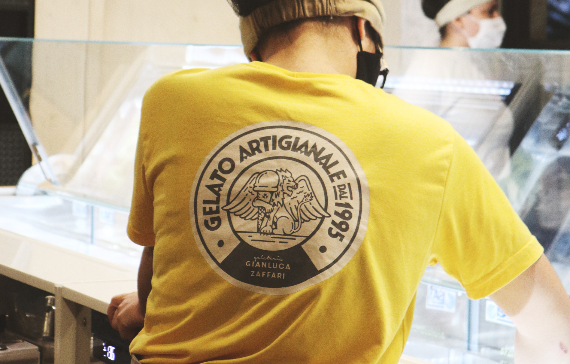
PT
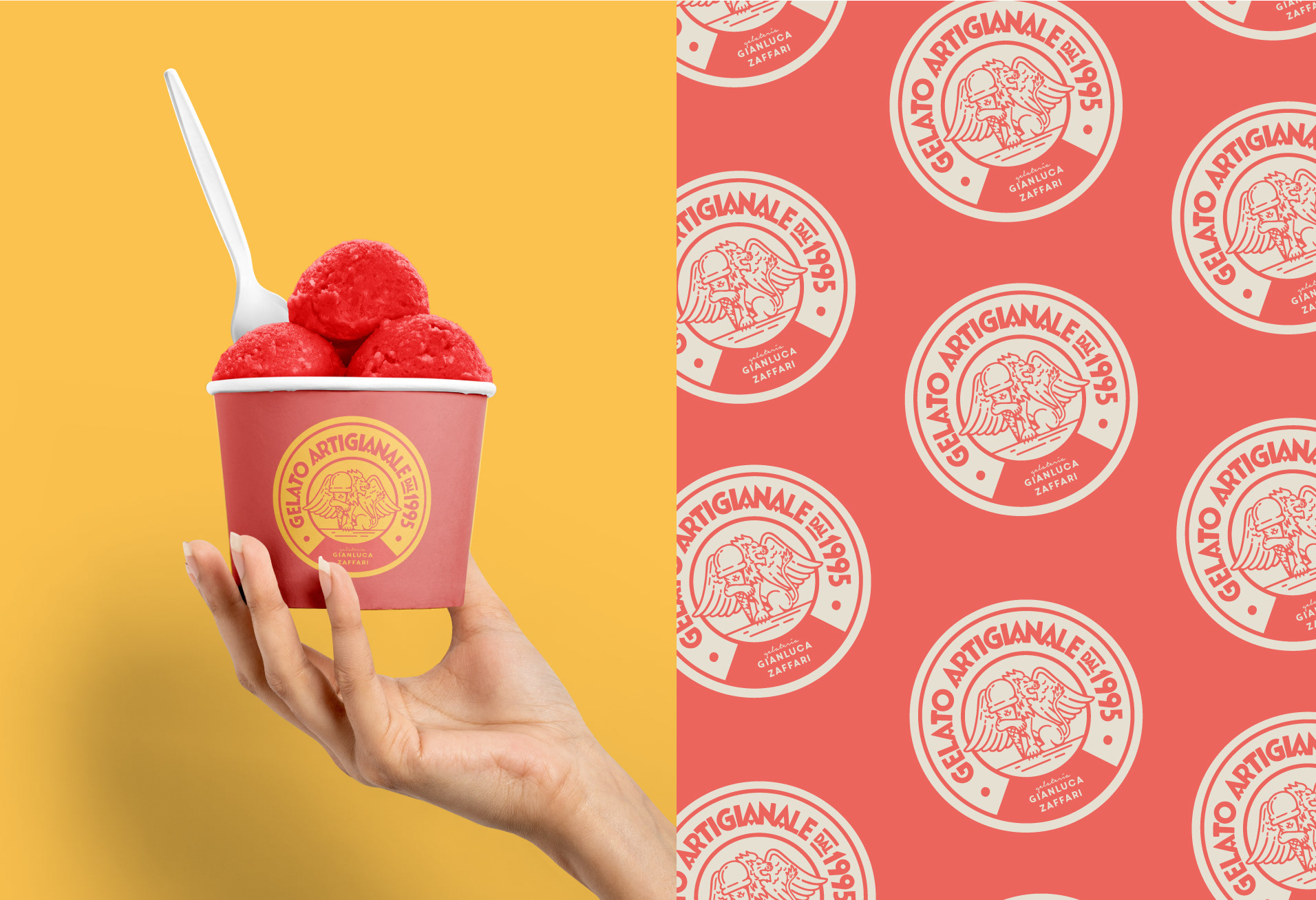
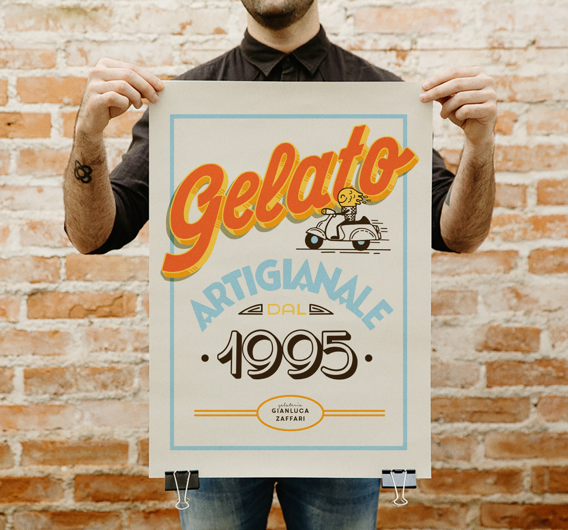
Depois de uma etapa de pesquisa tanto de história quanto visual, era hora de começar a desenhar. Inspirado em um estilo de letras muito comum na Itália no período art deco e que ainda sobrevive seja em rótulos, fachadas antigas e marcas tradicionais do país, encontrei inspiração para a criação do lettering. Para a ilustração, pela origem da família ser da região de Vêneto escolhi o leão alado símbolo da região. Colocar o leão que é um animal imponente e sério abraçado no sorvete quebra o arquétipo clássico do animal e deixa o selo mais simpático, se tornando um elemento muito fácil de trabalhar na comunicação da marca.
ENG
After a researching about the history and Italian visual culture, it was time to draw. Inspired by a very common style of letters in Italy in the Art Deco period and that still survives in labels, old signs and traditional brands from the country, I found inspiration to draw the lettering. For the illustration, as the roots of the family was Veneto, I choose the winged lion, that is the symbol of the place. To put a lion, an imposing and serious animal hugged in an ice cream breaks the classical archetype and leaves the label more kind, becoming a very easy element through the communication.
PT
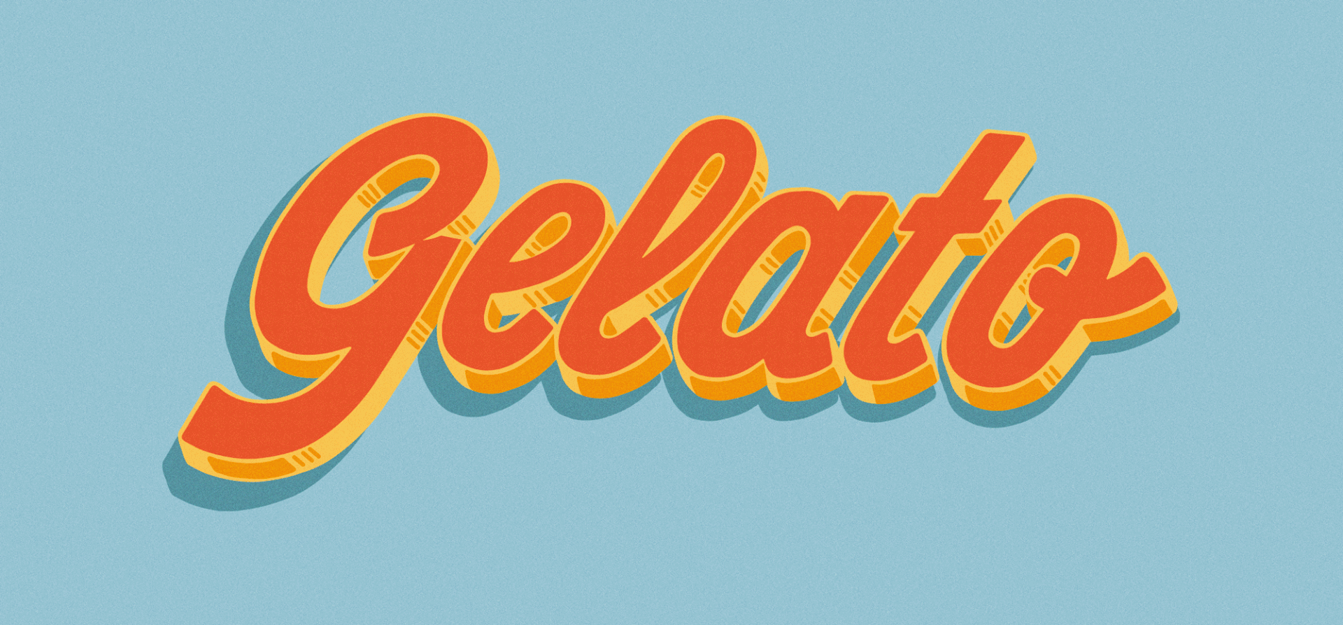
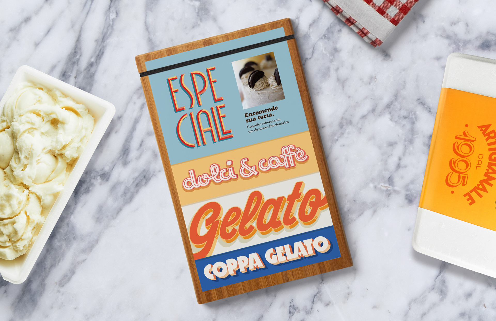
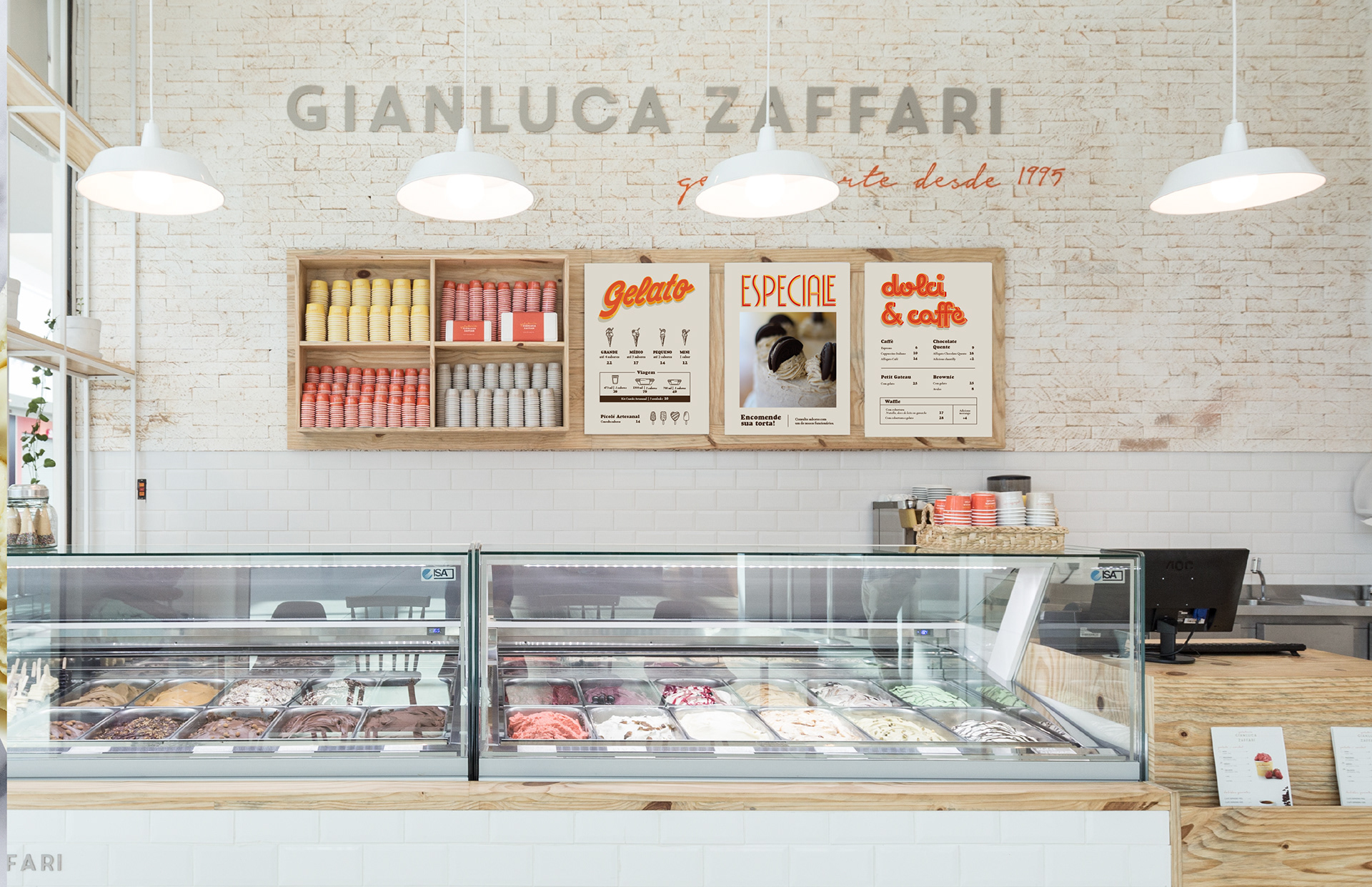
Para os materiais de apoio como menus e placas de sinalização utilizadas dentro da loja, foram desenvolvidos letterings inspirados nos típicos letreiros de fachadas na Itália.
ENG
In other materials, like menus and signs inside the store, it was developed letterings inspired on the typical old signs from Italy Streets.
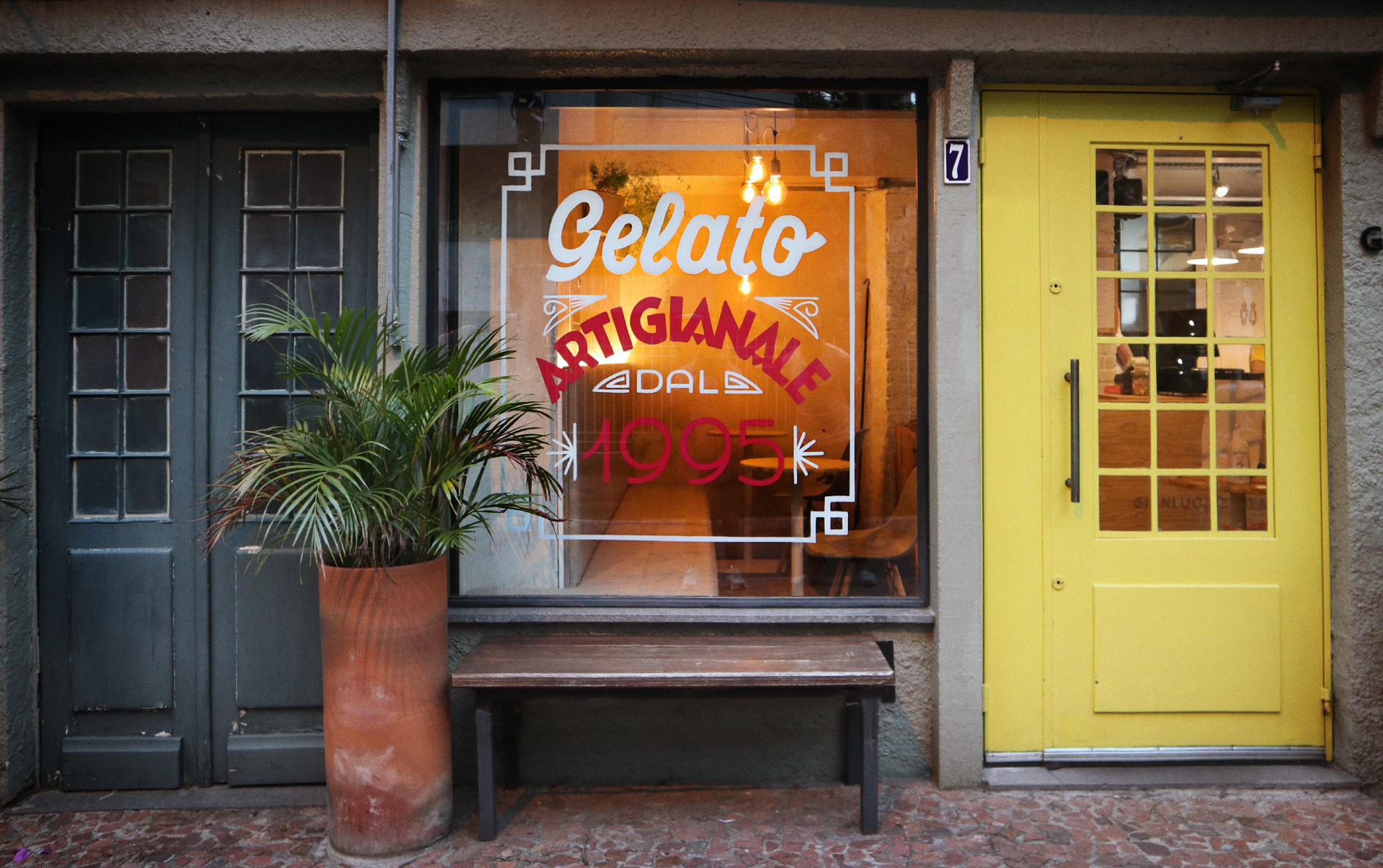
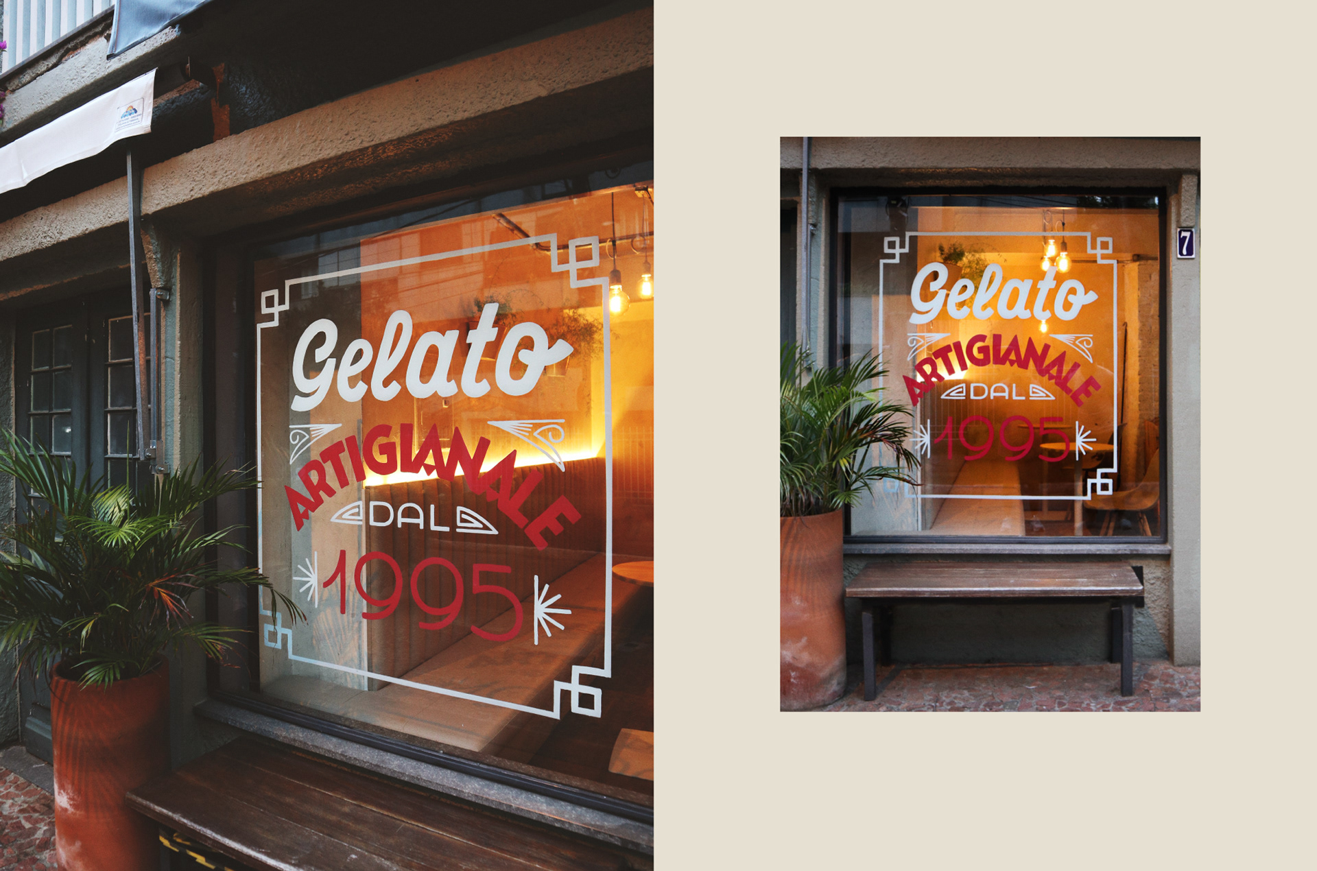
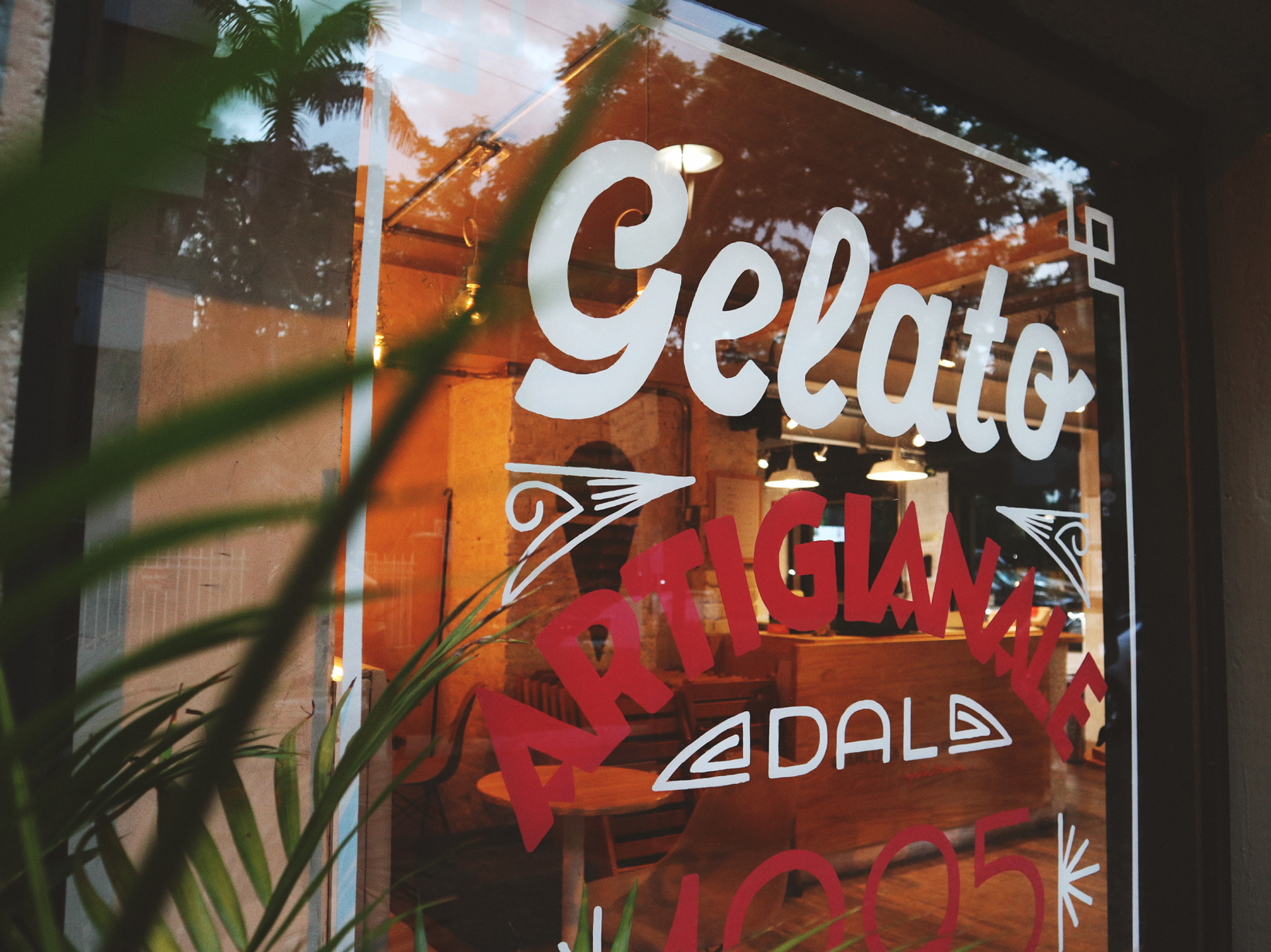
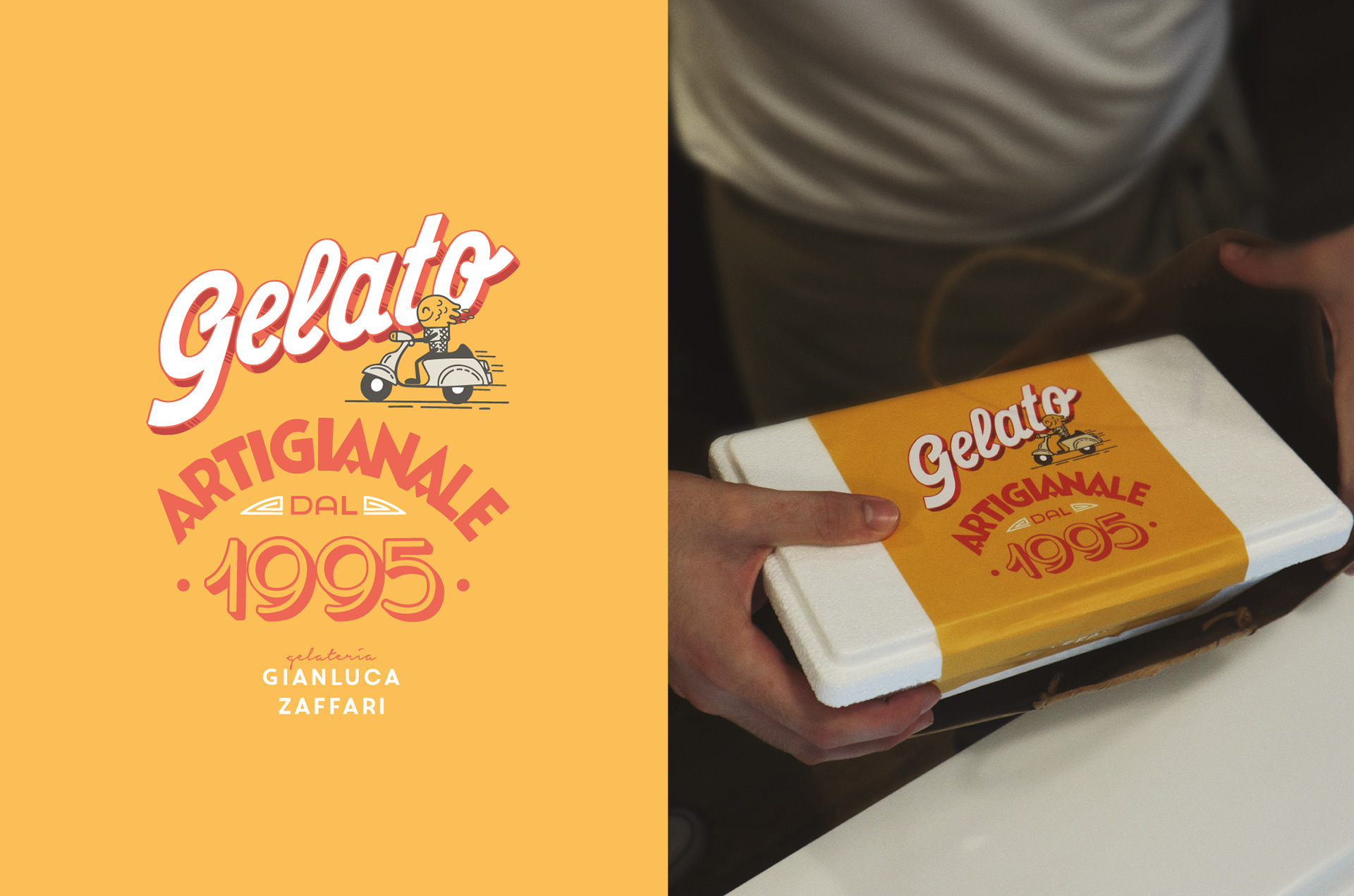
PT
Para ter ainda mais essa atmosfera italiana no projeto, pintamos a vitrine à mão na loja conceito como nas tradicionais gelaterias da Itália. Essa pintura também acabou virando um lettering para as embalagens do delivery, sendo agregado um sorvetinho simpático como entregador. Obviamente, ele está em uma Vespa.
ENG
To have even more this Italian aesthetic in the project, we hand painted the window in the concept store, as in traditional Italian ice cream parlors. This painting also ended up becoming a lettering for the delivery packaging, with a friendly ice cream added as a deliveryman. Obviously, he's on a Vespa.
Designed by @guasca.studio, 2021.
Client: Gianlucca Zaffari
Design: Matheus Mendes
Lettering: Matheus Mendes e Raquel Cassini
Illustration: Matheus Mendes